.04a
design
A hodgepodge of some of my design projects over the years. Each client has a unique vibe and personality which I bring out with type and images. From bands to retail stores, from concerts to holiday parties. All of it. I focus on print because I like the tactile feel of a product, a piece of paper, a object in my hand. Something to save. A memory. I studied letterpress, bookbinding, and printmaking because I have always been fascinated with books. I wanted to dissect them and learn how the pages correlated and why different type is used. I love the emotions a single typeface can portray. I also wanted to respect the origins of how we design today, and my Grandfathers career.

print & Promotion
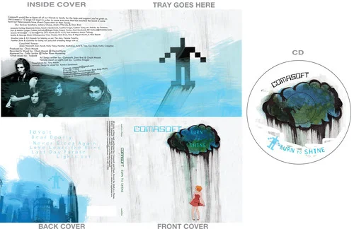
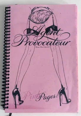
Projects from Lavender Cabaret, Comasoft, Maje, Oak St. Council and Agent Provocateur. Personal projects of Pickle Puss Pickles, and a few odd bits here and there. From postcards to CD's everything in print easily translates to a digital format.

typography
A book of Carl Sandburg's "Chicago Poems" hand set letterpress type printed at the Columbia Book & Paper Center. A folio of 6 poems machine stitched. This was an exercise purely based on type. A few other fun pieces thrown in below.

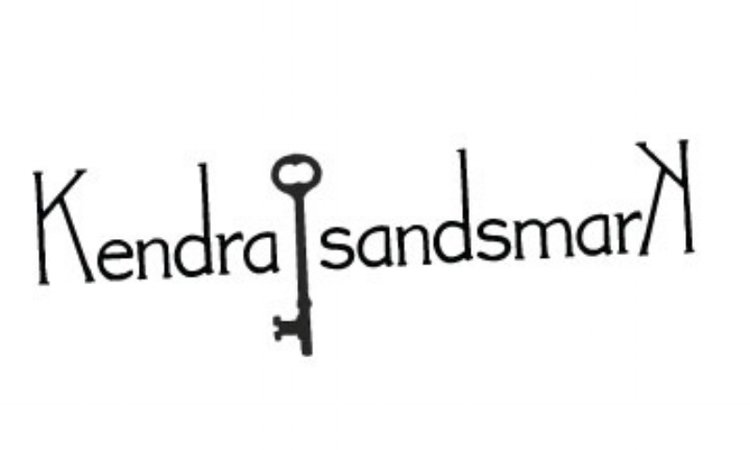
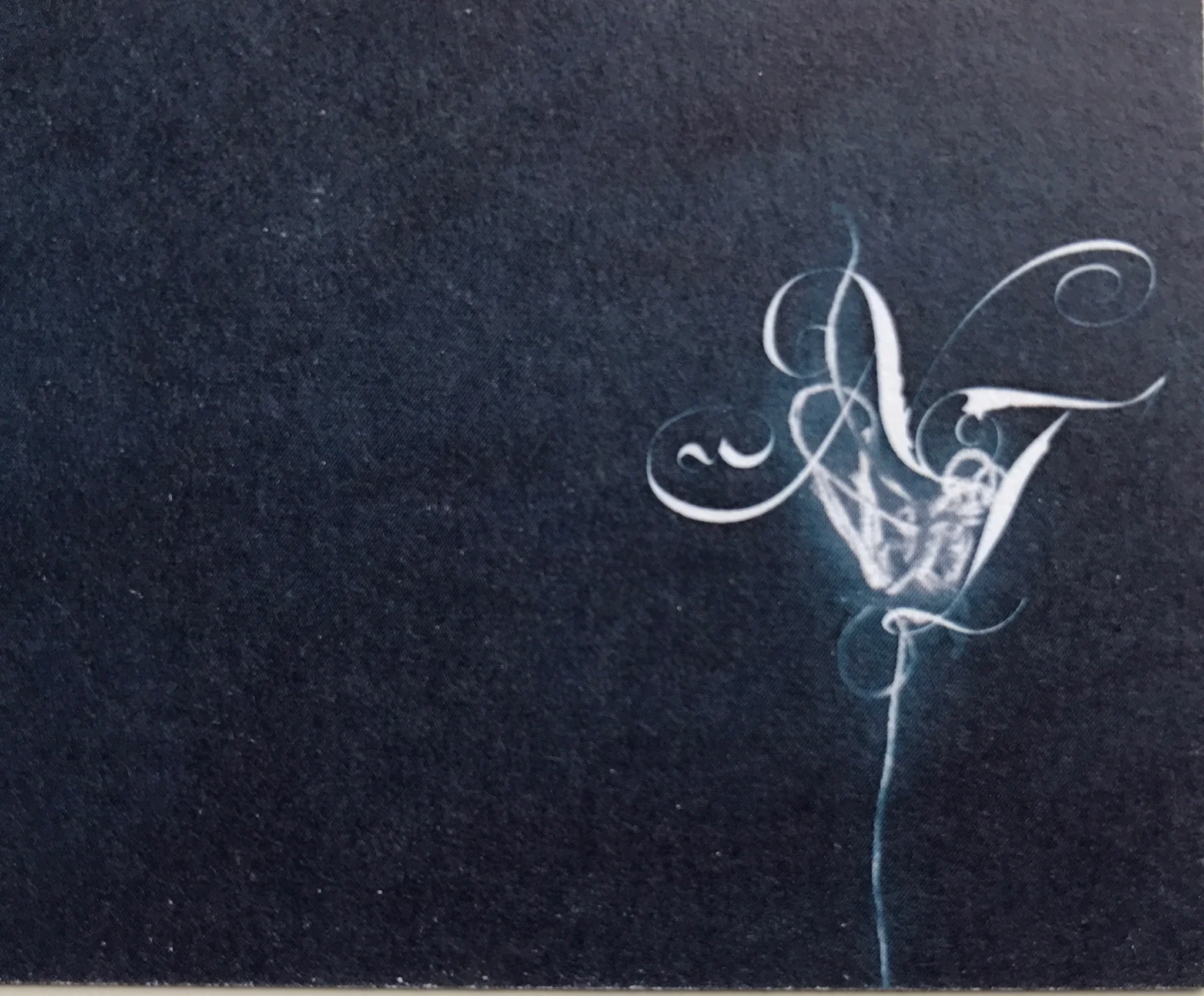
logo & Branding
Always a tricky thing, finding type and images to portray who you are and what you represent. How you want the world to see you and your product. I focus on non corporate subversive logo design that is a bit quiet and mysterious. Not your everyday logo. Projects from Pi, VioletO, Luxe Coffee, Lavender Cabaret.


![Fulllogo-[Converted].jpg](https://images.squarespace-cdn.com/content/v1/5447e487e4b02574d5d4e84d/1506574445453-FW1XJ2ACL3LAAET467ZT/Fulllogo-%5BConverted%5D.jpg)


.04b
Ink & art
Hey guys! I am an "artist"! I have been studying fine art since high school and here are a few pieces I do for fun. Keep your creative juices flowing and keep going. I love collage and ink painting. One day, ONE DAY I will go back to my oil paintings!


